We have a steady supply of Covid-19 statistics and graphs on sites like Worldometers with their corona virus page, and Our World in Data, and their corona virus page. Some of the available graphs have an option to show “Moving Averages” with averages of 3 days or 7 days. These averages smooth the data to hide rabid fluctuations. For example, this Worldometer graph that was accessed on Dec. 22, 2020, allows us to display both 3-day and 7-day moving averages.
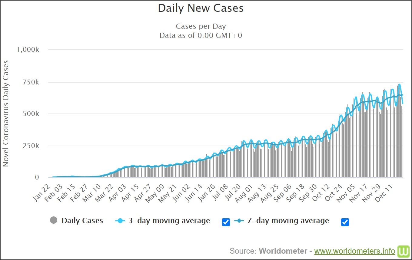
Fig. 1: World Daily Covid-19 Cases From Worldometer, (accessed Dec. 22, 2020)
The Covid-19 daily case data is interesting because of the flucutations that we see. These happen weekly because of varying reporting schedules – many places don’t report on weekends and then report multiple days on Monday or Tuesday. We can zoom in on a few weeks to see this in more detail as in Fig. 2 where we can see the data for six weeks from Sunday, Nov. 1, 2020 to Sunday Dec. 13, 2020.
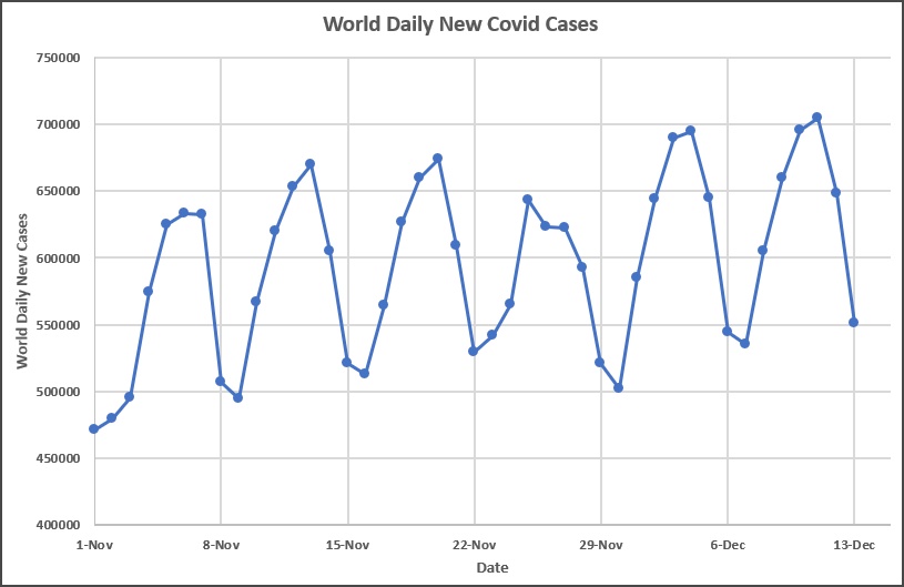
Fig. 2: World Daily Covid-19 Cases From Worldometer for Six Weeks
The line drawn connecting the data points is done simply to guide the eye and make the pattern clear.
We want to understand the moving average calculations typically provided by these webistes as well as Excel. The values for 3-day moving average calculated by the Worldometer website is shown in Fig. 3. The dotted line shows the 3-day moving averge values which were extracted from the World-meter graph.

Fig. 3: World Daily Covid-19 Cases From Worldometer for Six Weeks with 3-Day Moving Average
An interesting thing to note is that the moving average curve is shifted to the right relative to the actual data points. The 7-day moving average loses the oscillations, for the most part, so the effect isn’t so obvious. In what follows we will clarify how the moving average is calculated so we can understand this shift, and suggest a different way of calculating a moving average.
Fig. 4 shows a section of an Excel worksheet to start the calculation of the 3-day moving average. The left side shows the details of the formula in cell C5 and the cells used in the calculation are highlighted. We find the sum of the range B3:B5 and divide by 3. We could equivalently use the Average() function in Excel and get the same result.
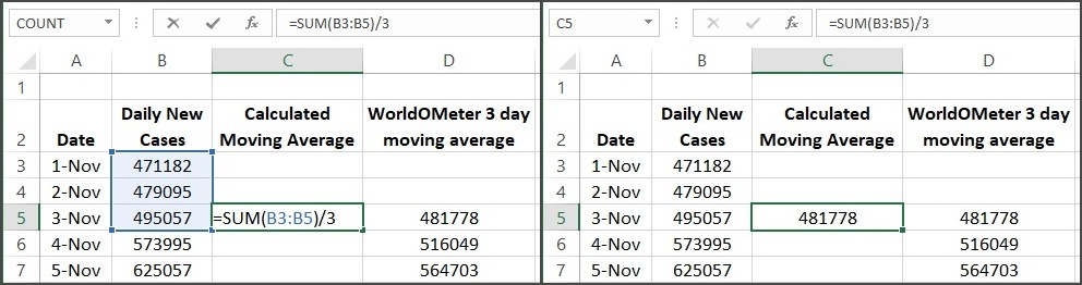
Fig. 4: Calculation of the 3-Day Moving Average at the Endpoint of the Range
The right side of Fig. 4 shows the result of the calculation in cell C5. The data are in column B, which are used in the calculation of the moving average. The moving average values from Worldometer are in column D. Note that the calculated value in cell C5 is the same as in cell D5 so we seem to be correctly replicating the Worldometer calculations.
This is just the calculation for a single cell, but this average is supposed to be “moving”. Fig. 5 shows how the calculation progresses for a range of values.
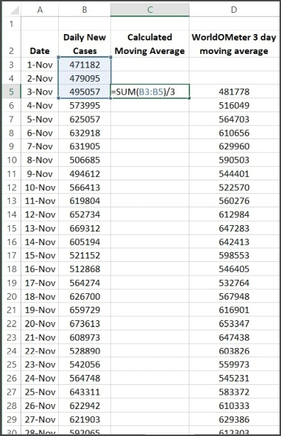
Fig. 5: Progression of the 3-Day Endpoint Moving Average
To calculate the 3-day moving average value for Nov. 3, we use the data from Nov., 1, 2 and 3, find the average of those 3 values and that is our moving average value for Nov. 3. When the data for Nov. 4 becomes available, we use the data values for Nov. 2, 3 and 4, find their average and the result is the moving average value for Nov. 4. This process continues through the set of data that we have and simply continues as new data becomes available. It is very simple to add a new data point every day and have the calculation extended.
One potential issue that we see with the calculation of the 3-day moving average in Fig. 3, is that the calculated graph is shifted to the right a bit from the actual data points. This could potentially impact decisions based on the data set so it is worth understanding the cause of this effect. This happens because the moving average is calculated using the current day, and two previous days. We could do a moving average calculation where we average Nov. 1, 2 and 3, and this becomes the moving average for Nov. 2 so the average replaces the midpoint value of the interval, instead of the endpoint. The result of this calculation is shown in Fig. 6 with the actual data points.
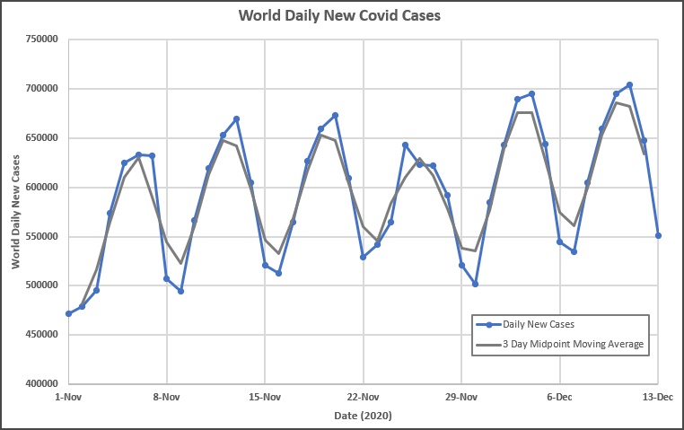
Fig. 6: Graph of the 3-Day Moving Average for the Midpoint of the Range
Note that this version of the moving average calculation does not show the peaks and valleys (maxima and minima) shifted relative to the data points. The averaging does what it intended, in that the calculated peaks are a little lower and the bottoms of the valleys are a little higher than the data. This is what we expect to see in a moving average calculation. This also occurs in the moving average calculation shown in Fig. 3 where the endpoint calculation is done but there we see a shift of the calculated values to the right, which may be undesirable for some purposes. To be clear about the way that the midpoint moving average is calculated, the calculation for the first point is shown in Fig. 7
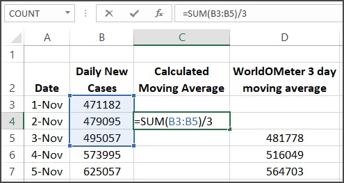
Fig. 7: Calculation of the 3-Day Midpoint Moving Average
Note that the calculated average now goes into cell C4, to become the value for Nov. 2. This pattern continues down to the end of the data. We aren’t able to calculate a value for the last day of the data with this method of calculation.
Why do all this? First, I was curious about the details of the moving average calculation and understanding the shift that I thought I saw in the calculated moving average. That has been cleared up now. Second, I wanted to clarify what is used to calculate the moving average in Excel since I hadn’t really thought about it before.
In Excel, we can add a moving average trendline by selecting the data series, right clicking on one of the points and choosing “Add Trendline…”. This opens the Format Trendline dialog where you can select the Moving Average radio button and set the Period to 3. This gives exactly the endpoint moving average as shown in Fig. 3. The curve is the same, but we don’t see the values. The moving average can also be calculated using the Data Analysis addon and it’s no surprise that the results are again the same, and this case we get to see the actual numbers easily.
We have used the 3-day moving average to clarify the mechanics of the calculation because the oscillations make shifts relative the data easy to see. The 7-day moving average is more useful to see the overall trend in the Covid-19 data. This is because the 7-day moving average uses data covering an entire week and so tends to smooth out the weekly oscillations that we see in the raw data. The result is shown in Fig. 8.

Fig. 8: The 7-Day Moving Average for Six Weeks
The orange dots in Fig. 8 show the moving average provided by the Worldometers site and the gray line shows the 7-day midpoint moving average. Note that the endpoint caclulation of the moving average is shifted to the right by 3 days relative to the midpoint moving average calculation – this can be checked by comparing low or high points in the curves. The average is doing its job in smooting out the 7-day cycles so we see the longer-term behaviour in the data. We can see that the number of daily new cases has increased by almost 75,000 over the six week period shown.
The detail of the 7-day moving average calculated using Excel is shown in Fig. 9. The left side of Fig. 9 shows the way that Worldometers, Excel and other software typically calculate the moving average. The right side of Fig. 9 shows the midpoint calculation of the moving average, which doesn’t seem to be the standard way of doing things, but doesn’t artificially shift the results to the right relative to the data. Note that the larger the interval we use for the moving average calculation, the larger the shift is going to be.
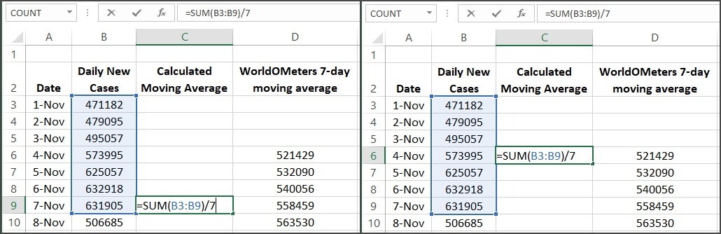
Fig. 9: Calculations of the 7-day moving average: (left) endpoint, (right) midpoint
The point of the moving average calculation is to smooth out the data so we aren’t distracted by the quick changes. Appropriate choice of the length of the interval that we use for the averaging calculation makes a big difference in what we see as a final result, for example compare the 3-day and 7-day moving averages shown in Fig. 3 and Fig. 8 above. We need to at least understand the details of how the moving average is calculated if we notice a shift in the calculation relative to the data.
In conclusion, the moving average is calculated in various statistical tools, including Excel which has been used here. The same type of calculation is used when editing digital photos and you apply a “smoothing filter”. In engineering this is referred to as a “low pass filter” because the things that change rapidly are averaged out and we are left with the slowly changing behaviour. Finally, in mathematics, this is called a “convolution”. Fun, eh?
Leave A Comment