We discussed inserting error bars into an Excel chart in the post Error Bars in Excel. We showed how to add constant errors, constant fractional errors and error bars that vary with every data point. We didn’t discuss the source of these errors just how to add them to the chart.
Excel has other options available in the “Amount Error” section of the “Format Error Bars” dialog box. We are going to look at the effect of the Standard Deviation radio button on our chart.
The standard deviation provides a measure of the spread in a data sample. In Excel, we can do the calculation of statistical quantities such as mean, variance and standard deviation ourselves using the defining equations, or we can use functions builtin to Excel to save ourselves typing in long equations. The error bar dialog has a radio button marked “Standard Deviation(s)” that adds a set of error bars to a chart. The interpretation of those error bars can use a bit of explanation.
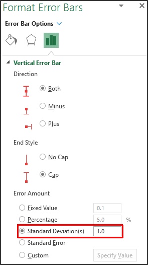
Fig. 1: Standard Deviation Error Bars in Excel
The website Our World in Data has a huge amount of interesting data for us to download and load into Excel. We are going to use some points from the dataset for average height by year of birth. In particular, we have the following points for men and women
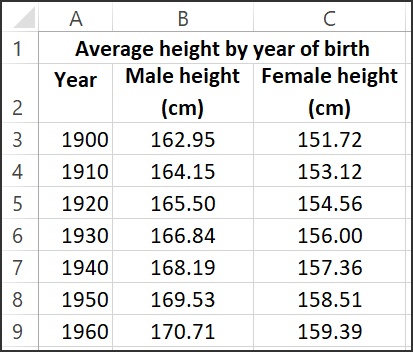
Fig. 2: Average Height by Year of Birth
Note that over this time period, both men and women are, on average, taller if they are born later in the century.
We went through inserting a Scatter Chart in the previous article: Error Bars in Excel. We are just going to use the data for males for now, so type it into an Excel worksheet. Select the range containg the column headers and numerical values, so A2:B9 and go to the Insert tab and choose a scatter plot with just points – you will get this chart

Fig. 3: Average height for males vs year of birth
We can click on one of the data points on the chart and the series is selected, and the range that provides the data for the chart is highlighted with color.
To add Standard Deviation error bars to the chart, click on the Chart Elements button in the upper right corner of the chart – click on the triangle next to Error Bars and then click on Standard Deviation as shown in Fig. 4. Note that the Standard Deviation option is also available if you select More Options.
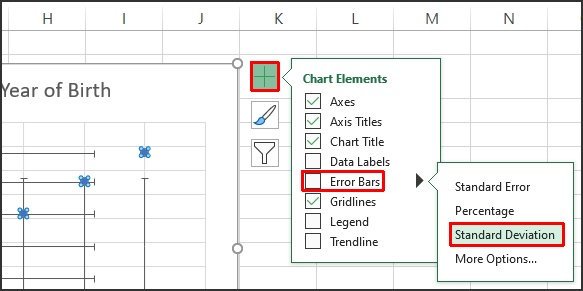
Fig. 4: Chart Elements
As you hover your mouse pointer over Standard Deviation, you will see a preview of the default error bars that Excel will create – these include bars for both the X and Y directions. This is fine, click on Standard Deviation and we will make adjustments after. The resulting chart looks like Fig. 5.
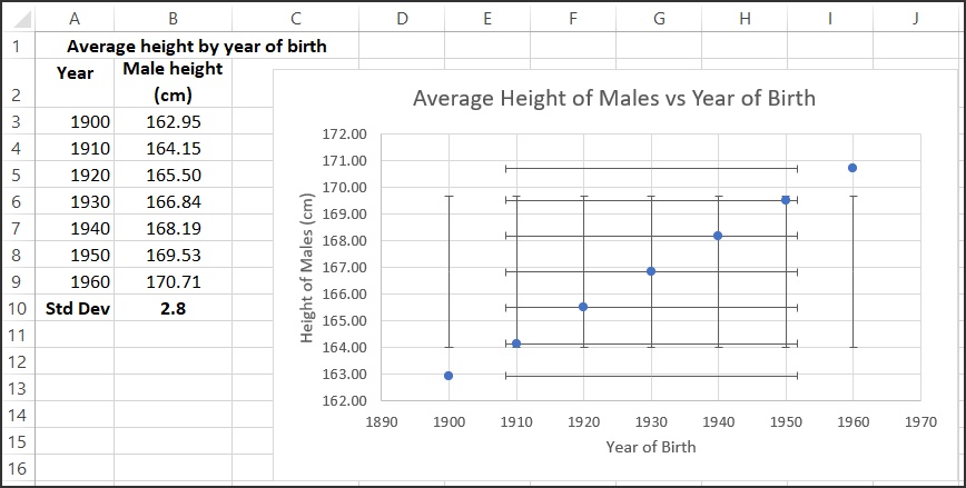
Fig. 5: Average height for males vs year of birth with Standard Deviation error bars
This looks a bit confusing because the error bars aren’t centered on the data points in most cases. We also don’t need error bars for the year of birth – we can get rid of these to simplify the chart. Click on any one of the horizontal error bars and the whole set of those error bars is selected, then hit the Delete button and the horixontal error bars will be gone leaving a chart that looks like Fig. 6.
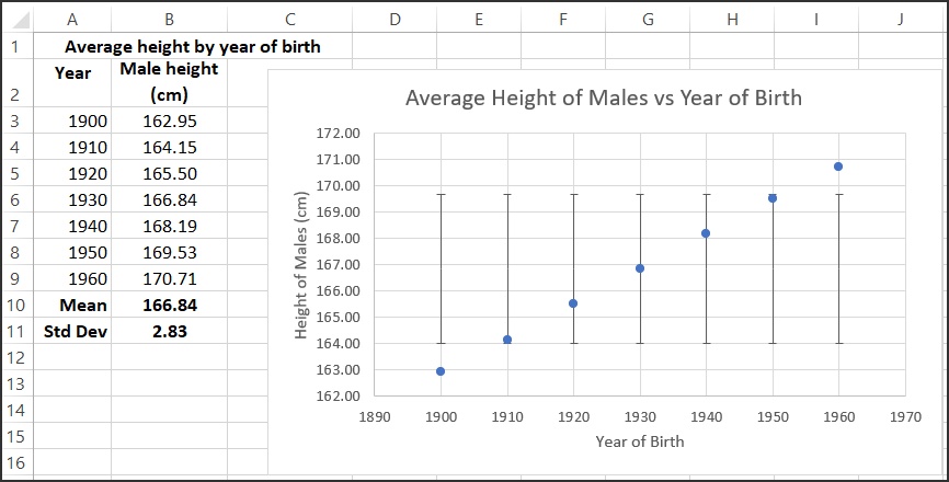
Fig. 6: Average height for males vs year of birth with X error bars removed
To understand what Excel is showing us in this chart, note that cell B11 shows the standard deviation of the heights calculated using the formula: =STDEV.S(B3:B9). This calculates the standard deviation of the sample in the range B3:B9. In this case the standard deviation of the heights is 2.83. The average value of the heights (the mean) is calculated in cell B10 with the formula: =AVERAGE(B3:B9), and the average is 166.84. The default in Excel is to draw these error bars showing 1 standard deviation above and below the mean (go back to Fig. 1 to see this) so the bottom of the error bar is at 166.84 – 2.83 = 164.01, and the top of the error bar is at 166.84 + 2.83 = 169.67. This agrees well with what we see Excel draw on the chart.

Fig. 7: Average height for males vs year of birth – 1 Standard Deviation
The standard deviation that we calculate for this set of data does not reflect an uncertainty for each individual data point. As we see in Fig. 7, the colored area includes one standard deviation above and below the average (mean) of data points. We don’t know anything about the probablility distribution of the population at this point, but one standard deviation often includes about two thirds of the data points, no matter the distribution.
Excel won’t automatically create a coloured area to indicate the range of data covered by one standard deviation, but we can add this manually with a rectangle from the Illustrations group on the Insert tab. Go to Insert→ Illustrations → Shapes and choose a rectangle. Adjust the properties to your liking: the rectangle in Fig. 7 has 50% transparency and no border line.
We have not discussed standard deviations in general, only what happens when we choose the Standard Deviation button in the Excel Error Bar options. Note that the formula Excel uses to calculate the standard deviation is for the sample not a population:
SD = \sqrt{\frac{\sum((x - \mu)^2)}{(N-1)}}where \mu is the sample average, and N is the number of points in the sample. This is the same calculation that Excel does with the function STDEV.S().
Leave A Comment