Microsoft Excel is a spreadsheet program with an interface formed from a set of cells arranged in rows and columns. The columns are labelled with letters along the top of the work area, and the rows are numbered down the left side of the work area. Every cell has a unique address formed by combining the column letter and row number as “C3” – this is the cell in column “C” and row “3”. Excel currently has a limit of 1,048,576 rows and 16,384 columns in a worksheet, a worksheet is 64 times taller than it is wide, so organizing data vertically, in column-oriented tables, is natural. Fig. 1 shows the address of the last cell in 64-bit Excel as of September 2021.
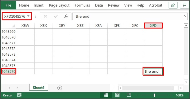
Fig. 1: Cell XFD1048576 – the largest cell address on a worksheet in Excel.
The word “Table” is used in several ways in Excel and it is a good idea to be clear about the different contexts where this word comes up. In the following we will discuss 4 uses of the word “Table” in Excel.
We sometimes see a rectangular selection of contiguous cells on a worksheet referred to as a table. In Excel this is properly referred to as a “range”. This type of range can be selected by clicking on the upper left cell and dragging the cursor to the lower right cell of the range. A range can also be a set of disconnected cells which can be selected by clicking on the first cell, and then holding the CTRL button while clicking on the rest of the cells. These types of ranges don’t look very tabular so the word “table” is generally not applied to them. More information about rectangular ranges can be found in our post Ranges in Excel.
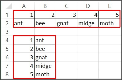
Fig. 2: Excel Array Range
In Fig. 2 we see two versions of the same data, one with the data organized in rows: A1:E2, and the other with the data organized in columns: A4:B8. Excel provides more tools to filter, sort and provide analysis when the data is organized vertically as shown in the range A4:B8. Many people use Excel to organize information in tables without wanting to do any further analysis. Powerful analysis tools are available when we organize our data so Excel can work with it easily.
The next use of the idea of a table in Excel involves converting a selected range into a named structure that has the ability to easily perform some operations including sorting, filtering and calculation of summary statistics. The Excel table allows us to work with a set of related data easily.
If we have a range containing information, we can convert the range into a table in one of two ways. First, click on a cell in the range, and
- Home tab -> Format as Table (in the Styles group) -> select the style you want for the table
- Insert tab -> Table
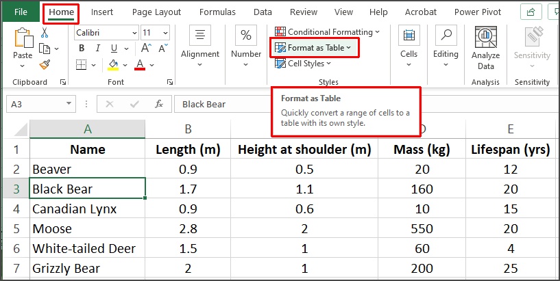
Fig. 3: Creating an Excel Table using Home -> Format as Table
In Fig. 3, a single cell is selected, and when Format as Table is selected a list of styles is presented for us to choose from. Click on the one you want and the Create Table dialog appears as in Fig. 4.
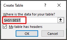
Fig. 4: Excel’s Create Table dialog
Excel will guess at the range of the table if there are no blank cells. In our case, the range is A1:E7, and the range has headers. Click on OK and Excel will create the table and apply the selected style as shown in Fig. 5.

Fig. 5: An Excel Table
Note that the table has rows shaded in alternating colors, but more usefully, the column headers have drop-down arrows which give access to sorting and filtering tools which can change the view of the data in the table with a small number of clicks. There are other nice features of Excel tables including a builtin-in Totals row for summarizing columns and dynamically growing and shrinking the table by adding or removing rows.
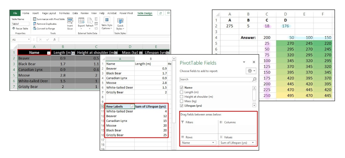
The PivotTable is the third use of the word “table” in Excel. The PivotTable adds functionality for data exploration to an Excel Table or range. We can add a PivotTable by selecting the range or Excel table and then going the Insert tab -> Tables group and select the PivotTable command. This opens the PivotTable dialog shown in Fig. 6. The Table/Range: field is filled in from my selection or Excel’s best estimate of the edges of the table/range. We have the option of putting the PivotTable on either the same worksheet as our range, or a new worksheet. In this case the new PivotTable is going below the table with the upper left corner of the PivotTable in cell A10.
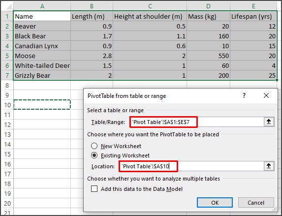
Fig. 6: Creating a PivotTable from a table or range.
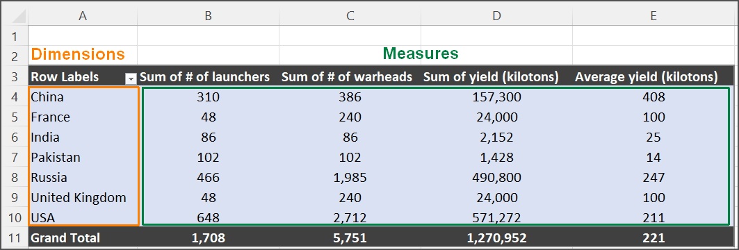
Clicking OK opens the PivotTable Fields area on the right side of the Excel window as shown in Fig. 7, and the PivotTable itself has space moving right and down from cell A10 as mentioned above. The number of rows and columns in the PivotTable area depends on how we arrange the data fields in the area in the lower right corner of Fig. 7. This is the working area of the PivotTable and allows for complex analysis of even large datasets. In the example of Fig. 7, the Name field has been dragged to the Rows area and Lifespan has been dragged to the Values area. The rows have been sorted by increasing lifespan.
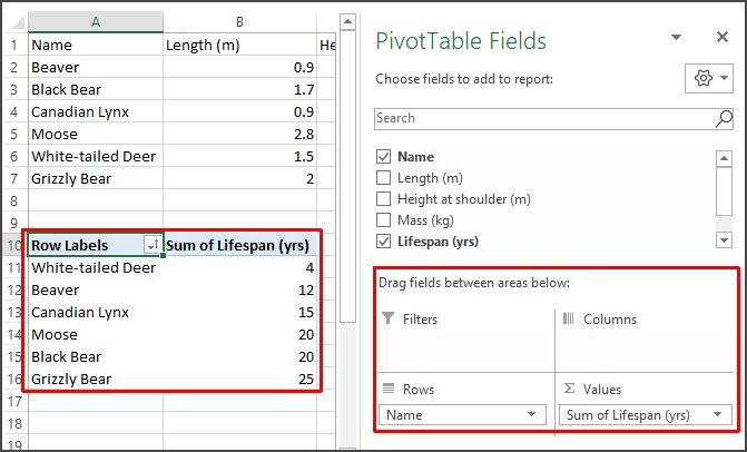
Fig. 7: A simple PivotTable showing age of some sample animals.
We can’t go any deeper into using PivotTables here. For our purposes it is enough to be able to distinguish the different tables we see in Excel.
The fourth use of the word “Table” appears on the Data tab, in the Forecast group, under What-If Analysis where we have a “Data Table…” option.
For a brief discussion of What-If Analysis and Data Tables, see our post What-If Analysis in Excel, in particular the section on Data Tables. Fig. 8 shows an example of a 2-input data table. The values in the column range C5:C14 will be entered into the cell C2, while the values in the row range D4:F4 will be entered into cell D2. The result of the calculation in cell C4 is then entered into the output range D5:F14. The colored range shows the result of the calculation for every possible pair of values in the row and column ranges.
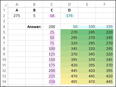
Fig. 8: An Excel Data Table with conditional formatting
The Data Table allows us to explore changes for either one or two input values to a calculation to examine the possible outcomes.
A data table cannot accommodate more than two variables. If you want to analyze more than two variables, you should instead use scenarios. Although it is limited to only one or two variables (one for the row input cell and one for the column input cell), a data table can include as many different variable values as you want. A scenario can have a maximum of 32 different values, but you can create as many scenarios as you want.
Excel documentation has a page entitled “Calculate multiple results by using a data table” which demonstrates using a Data Table with the PMT() function.
The word “Table” has some very different uses in Excel and it is important to be clear about which table can meet our needs. This will allow us to make the most efficient use of this powerful software.
Leave A Comment