Excel’s AnalysisToolPak offer a variety of routines for analyzing statistical, scientific and engineering data. In this articular we are going to look at how to use the correlation tool in the Analysis ToolPak.
Enable the Analysis ToolPak:
Although already installed with Excel, the Analysis ToolPak will need to be enabled through the Options menus. For the following example we are going to use Excel 2016 (similar steps are used for the 2010 and 2013 versions).
To enable the Analysis ToolPak do the following (here is the text version; a step-by-step with screen captures follows):
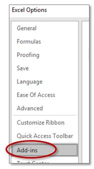
- In the File Tab, select Options, then in the left hand panel click on Add-ins.
- At the bottom of the right hand panel, in the drop down menu select Excel Add-ins (if not already selected), and click on GO.
- In the resulting dialog box click on the Analysis ToolPak then click on OK.
Here is a Step-by-Step to Enabling Analysis ToolPak:
File -> Options -> Add-ins
Next click on the “Manage:” menu; select Excel Add-ins; then press Go
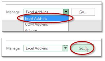
Click on the Analysis ToolPak check box, and click on OK

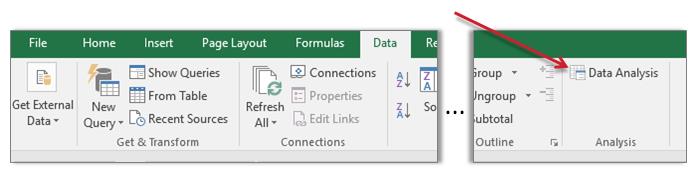
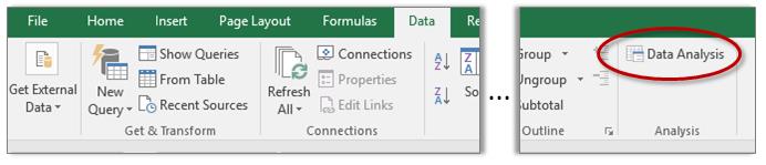
Now on the Data Tab there will be a new command “Data Analysis”:
Using the Correlation Tool
Once the Data Analysis tool box has been enabled, the correlation tool is ready to use.
A Correlation is an indication as to whether there is a relationship between two data. Excel uses the Pearson function to calculate the correlation, which will return a value between 1 and -1. A value of 1 indicates a positive correlation, a value of 0 indicates no correlation, and a value of -1 means there is a negative correlation.
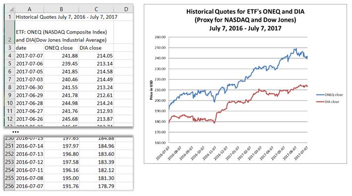
For this example, we are going to use data from two stock market indexes: NASDAQ Composite Index and the Dow Jones Industrial Average. For illustration purposes we are using the daily closing price data from the exchange traded funds ONEQ and DIA as proxy for the indexes. (Data for Fidelity® Nasdaq Composite Tr Stk ETF (ONEQ) and SPDR® Dow Jones Industrial Average ETF DIA from: www.nasdaq.com/etfs).
Data for the Example:
Here is a sample of the first few and the last few lines of the example file of the data for one year (as well as a simple line graph of the data):
Run the Command:
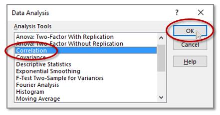
To Run the Correlation Command, click inside the data sheet, then in the Data Tab click the Data Analysis command: Data -> Data Analysis
In the resulting dialog box, select Correlation, then OK
The Correlation dialog box will open:
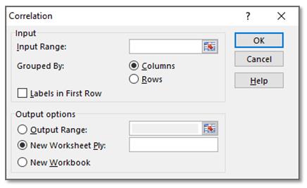
Fill in the Required Fields:
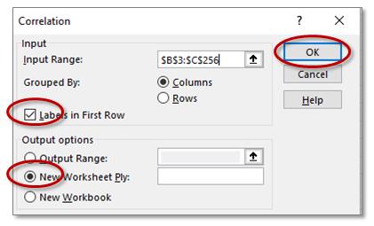
For the Input Range simply type in the range (such as, B3:C256).
If you prefer to highlight the range with the mouse, first click on the expand button for the Input Range

Then click and drag (or click then shift click) over the data. For this example, the range is from B3 to C256 (Excel will use absolute referencing, i.e., a $ will be placed before both the column and row reference):

Also, for this example, click on “Labels in First Row” since we have included the field headings with the data selection. And, if not already selected, click on the radio button “New Worksheet Ply” (Ply just means a layer or unit). Next, click on OK.
The Result:
The Correlation matrix will be placed on a new Sheet:
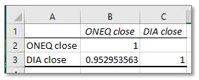
The Format of the Correlation matrix:
The headings in cells B1, C1, A2 and A3, are simply taken from the labels in the first row of the input data. The tool outputs a numerical value of 1 if the data is perfectly correlated. The value in cell B2 has the value of 1 because the correlation of data from “ONEQ close” is perfectly correlated with itself. The same is true with the value in cell C3, i.e., data from “DIA close” is also perfectly correlated with itself. There is no value in cell C2, mostly because of notation convenience, the matrix is symmetric along the diagonal and the value in cell C2 would be identical to the value in cell B3.
In this example the correlation between the two data sets, “ONEQ close” and “DIA close”, is the value that we are most interested in, and it is 0.95. This is indicating that there is a strong correlation between the two data sets. This makes sense when we look at the graph of the two data sets, they seem to generally move up and down together.
Leave A Comment