Once the Data Analysis toolbox has been enabled, the correlation function is ready to use.
For this example, we are going to use data from two stock market indexes: NASDAQ Composite Index and the Dow Jones Industrial Average (https://ca.finance.yahoo.com/quote/ONEQ/history?p=ONEQ and https://ca.finance.yahoo.com/quote/DIA/history?p=DIA)
.
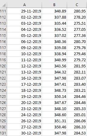
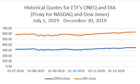
The data is the daily closing price for the last 6 months of 2019. Here is a sample of the first few and the last few lines of the example file, and a graph of the data for the last 6 months of 2019: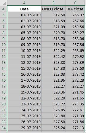
To Run the Correlation Command, click inside the data sheet, then on the DATA Tab click the Data Analysis command: DATA -> Data Analysis
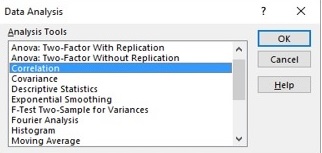
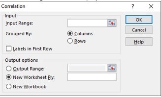
In the resulting dialog box, select Correlation, then OK
Another dialog box will be displayed:
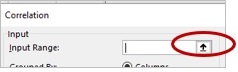
If you haven’t selected the data range beforehand, click on the expand button for the Input Range:
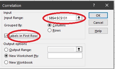
Then click and drag (or click then shift click) over the data. For this example, the range is from B3 to C130:
Also for this example click on “Labels in First Row”
The default is for the radio button for New Worksheet to be selected
Next click on ok
The Correlation matrix will be placed on a new Sheet:
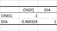
In the current case the correlation between the two data sets is 0.97 indicating that there is a very strong positive correlation between the both variables (max. value for the positive correlation is 1) or in other words there is a strong relationship between ONEQ and DIA data sets.
We created a post to help you understand the meaning of the correlation between the two variables.
Leave A Comment