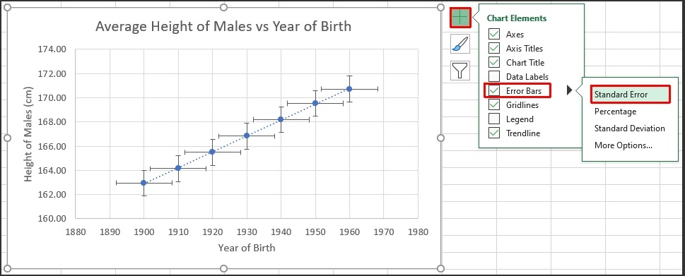
In previous articles we discussed adding fixed error bars and Standard Deviation error bars to Excel charts. The last option available on the Format Error Bars dialog is the standard error, short for “standard error of the mean”. Using the same data set that we used for the post Standard Deviation Error Bars in Excel, we can choose the Standard Error option from either the Chart Elements button in the upper right corner of the chart, or from the Format Error Bars dialog. Fig. 1 shows the preview when we hold the mouse pointer over Standard Error
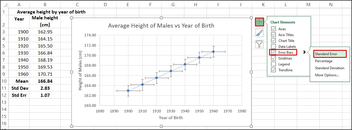
Fig. 1: Average height for males vs year of birth with Standard Error error bars
Click on “Standard Error” and Excel will add the errors for both the X and Y values in the series to the individual data points. All the points get the same standard error value. The standard error of the mean is calculated manually in cell B12 with the formula =B11/SQRT(COUNT(B3:B9)), which in this case gives 1.07. This is added as vertical error bars do each data point, going up by just over 1, and down by just over 1 from each data point. This can be seen clearly on the data point for 1900.
Note that there isn’t a function built into Excel to calculate the standard error of the mean so we need to use the definition – divide the standard deviation by the square root of the number of data points in the sample:
SEM = \frac{SD}{\sqrt{N}} = \sqrt{\frac{\sum(x - \mu)^2}{(N-1)(N)}}where \mu is the sample average, and N is the number of points in the sample. The standard deviation is the same calculation that Excel does with the function STDEV.S().
At this point we need to look carefully at what Excel is doing. Excel is taking the set of data points, calculating the standard deviation of the points, and then calculating the standard error. This is applied as an error to each data point. The standard error provides a measurement of the uncertainty in a set of means, so if the data points that we provide to Excel are the means of a set of samples from a population, the standard error gives us a measure of uncertainty for the mean of those means. This is not an error bar for each of the data points, however. We need to be very careful about how we use this Standard Error radio button in Excel because it can be misleading.
Let’s look at an example using the height data from Our World in Data. The original data can be downloaded by clicking on the Download tab at the bottom of the graph, and selecting to save as a csv (comma separated values) file. This data have been included in an Excel workbook that you can download here.
This workbook contains several worksheet tabs, some of which are shown in Fig. 2:
Fig. 2: Sample workbook tabs
The leftmost worksheet in the sample workbook contains the original data set from the source above. To the right of this sheet is the full dataset sorted by year, and moving right, the worksheets for specific years contain the mean data for 200 countries for that particular year: 1900, 1910, 1920, 1930, 1940, 1950, 1960 and 1970. The data are listed alphabetically by country name. Each of these sheets has a histogram of the frequency distribution of the heights.
For example, for the year 1900, the shortest male is 153.4 cm tall, and the tallest is 172.3 cm. The range of heights is divided into 2 cm wide “bins” and we count the number of countries whose people have average heights in that bin. We see that for the males, there are 41 countries whose males have average heights between 162 cm and 164 cm.
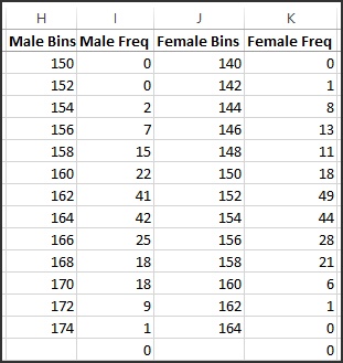
Fig. 3: Frequency bins for the year 1900
The table of Fig. 3 is called a frequency distribution and is shown in a chart in Fig. 4. For females (orange dots) the mean is 151.7 cm and the standard deviation is 3.9 cm. The curves on the chart show normal distributions with the same mean and standard deviation. These normal distribution curves are calculated using the Excel function “NORM.DIST()” with the averages and standard deviations calculated from the data, and scaled so the total number of countries is 200 – the same as the data.
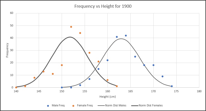
Fig. 4: Frequency vs. Heights for the year 1900
There is clearly some scatter in the data, but it is fairly normally distributed.
The worksheets with (2) in the name are region summaries. For each year, the data for 200 countries are summarized into 7 regions:
- East Asia and Pacific
- Europe and Central Asia
- Latin America and Caribbean
- Middle East and North Africa
- North America
- South Asia
- Sub-Saharan Africa
For the year 1900 the resulting data table is shown in Fig. 5. Again, the average heights for 200 countries are averaged into 7 regions. These region averages are then averaged to find a world average with the standard deviation and standard error of the mean (SEM).
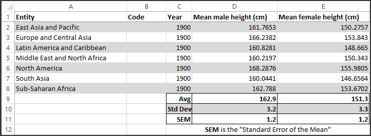
Fig. 5: Average height data for regions for the year 1900
In this case, we have seven samples (the regions) from the population of the world. The average of any one of these regions is an estimate for the average height of the population of the world. This value is a better estimate of the average of the population than taking any single random data point. The variation in the individual data points is measured by the Standard Deviation. If we now find the average of the seven region averages, that result is a better estimate of the population (world) average than any of the seven individual averages. The variation in those region averages is measured by the Standard Error of the Mean, and is smaller than the Standard Deviation of the population. The calculated Standard Deviation and the SEM for the region averages is shown in Fig. 5. Fig. 6 shows the average height for each region for the year 1900 for both males and females.
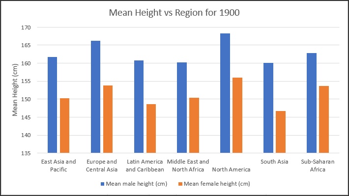
Fig. 6: Regional height chart for the year 1900
We do the same calculations for the other years on other worksheets of the workbook. Fig. 7 shows a summary of the average heights for the world for males (column D) and females (column E) for the years 1900 to 1970 – this table is contained on the final worksheet named “World”, along with a chart of the data, including SEM error bars shown in Fig. 8. Note that columns F and G in Fig. 7 are the SEMs corresponding to the average heights for males and females..
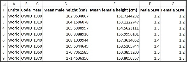
Fig. 7: World average height by year of birth data
The SEMs for male heights in Fig. 8 increase slightly over the decades, and we can see the actual values in Fig. 7 – in 1900 the SEM for males is 1.2, while in 1970 the SEM for males is 1.5. For females, the SEM stays the same over time and only increases a bit for the year 1970.
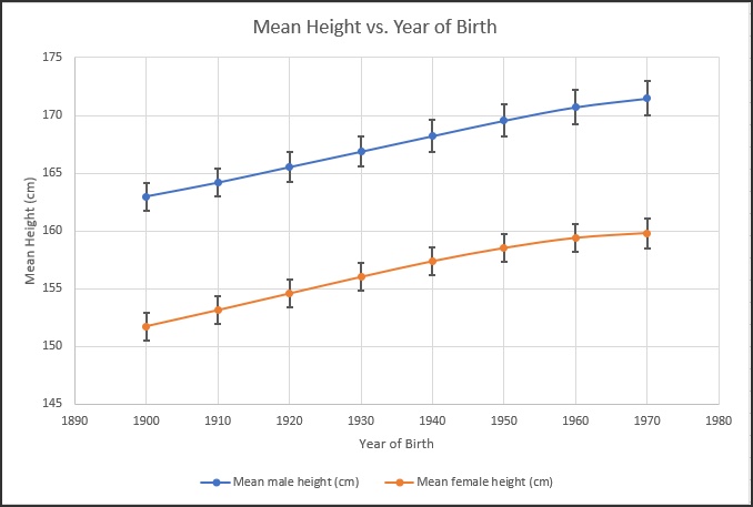
Fig. 8: World average height by year of birth chart
SEM error bars are a standard way to present uncertainly in some fields. The point of this article is only to demonstrate that the Standard Error button shown in Fig. 1, while providing error bars easily, may not give you a visual representation of the uncertainty in the data that you expect. In fact, it might be incorrect. We need to be careful in understanding what Excel is doing when we apply some of these powerful tools.
As mentioned above, this data has been included in an Excel workbook that you can download here.
Leave A Comment